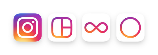
Everyone’s favourite social photo-sharing app now has a new look. Instagram’s much-loved retro camera look has been ditched for something cleaner, simpler. It says it’s “inspired by the previous app icon,” but personally, I think it has lost much of its identity.
The icon now features a simpler camera, and the rainbow is now a circular gradient. Instagram also updated icons for its other apps including Layout, Boomerang and Hyperlapse.
Instagram has also enhanced the look and feel within the app. It’s familiar, yet feels cleaner and slicker.
Check out the evolution of the logo in the video below:
https://vimeo.com/166138104
How hard was it to design the new Instagram logo?
Instagram users share over 80 million photos and videos every single day. It currently has over 400 million active users worldwide, making it the #8 most popular social network, as of April 2016 (Statistica, 2016).
The app is available for iOS, Android and Windows Phone.
What do you think? How do you like the new Instagram logo? Yay or nay? Leave your comments below.
Oh, if you haven’t already, follow me on Instagram
Source: Instagram blog


