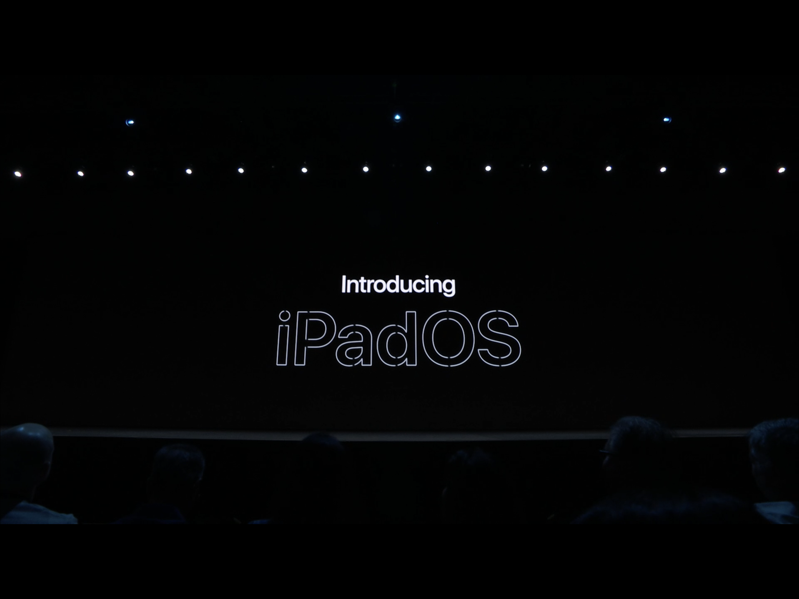
There was plenty to love at Apple’s annual Worldwide Developer Conference (WWDC) last week. And as I said it in my previous wrap-up post, I thought it was the best WWDC by far. While the world drooled over the all-new Mac Pro, I was more drawn to Apple’s new OS: iPadOS.
So, nobody anticipated yet another operating system to debut, but having seen what it can do it’s a move that makes total sense. The underlying architecture is still iOS, of course; in this case, iOS 13. iPadOS includes more features and enhancements that make full use of the iPad’s processing power, expansive screen, USB-C port and Apple Pencil.
When the iPad Pro was launched two years back, it was positioned as a productivity machine. Featuring ultra powerful hardware, a beautiful display and Apple Pencil, the iPad Pro was a creative pro’s dream.
The new iPad Pro last year was even better—beefier hardware, USB-C port, all-new Apple Pencil. The perfect combination for Adobe Photoshop for iPad that was previewed late last year at Adobe MAX.
iPad is awesome, but…
But the problem with the iPad family (especially the iPad Pro regardless of generation) was never the hardware. It’s the inherent limitations of iOS. I hate to use the word crippling, but to some extent it is.
Explained simply, while Apple has done a great job at optimising iOS for the bigger iPad screen, there are still things left to be desired. If anyone was going to take the iPad seriously as a productivity tablet, or if you’d like, a notebook replacement, then it would need more desktop-class features, so to speak. It needed to be a little more “Mac.”
I’ve been using the 12.9-inch iPad Pro as my main work/play machine for about two months now, and it’s been fantastic, mostly.
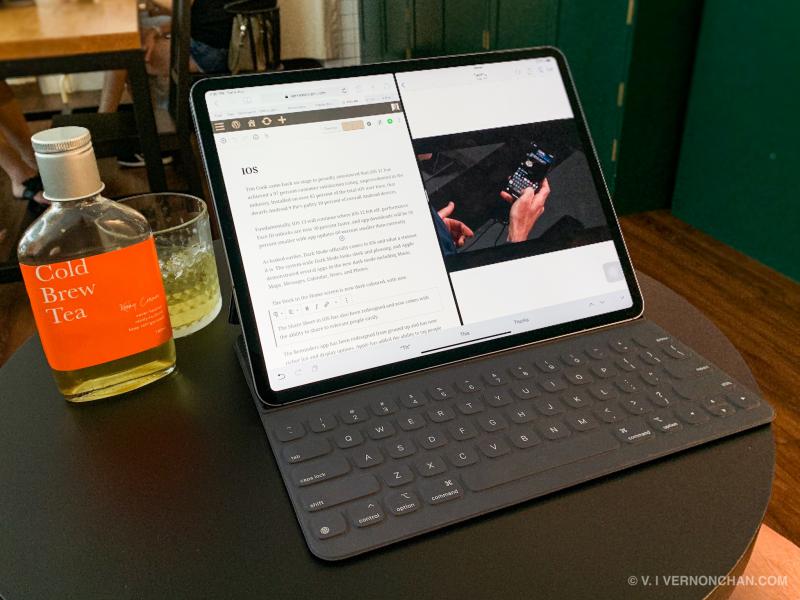
It’s stupendously fast, the Retina display is fantastic, the quad stereo speakers are fabulous and iPad apps are unmatched.
When it comes to work though, it’s a life of compromise. For one, file management is a mess. It takes a convoluted way to access certain files; it’s not as easy to share files across different apps, and etc.
And while I almost never use a USB thumb drive or at least an external USB drive with the iPad, some find the lack of support given the availability of a USB-C port, kind of deal breaking.
Split View and Slide Over provide the best multi-window, multitasking experience on any platform, in my opinion. Although to be fair, you’re limited to only two windows side-by-side (Windows can do more). That said, it’s slick, intuitive, and drag-and-drop-level easy.
The limitation though, is that you can only have two different apps side-by-side. There’s no option to do multi-documents or multi-files of the same app.
For instance, as I’m typing this article in WordPress from Safari, I can’t have share another window with another Safari tab. I can’t have another window of a webpage for which I need to refer to open side-by-side. The current solution for me is to open another browser, like Chrome.
Also, another gripe is mobile browsing on Safari (or any other browser for that matter). Despite more real estate, browsers load mobile versions of websites by default. This is incredibly annoying especially if you’re trying to load a page like Google Docs or YouTube in the browser.
Well, Cupertino listened.
The iPad, only better
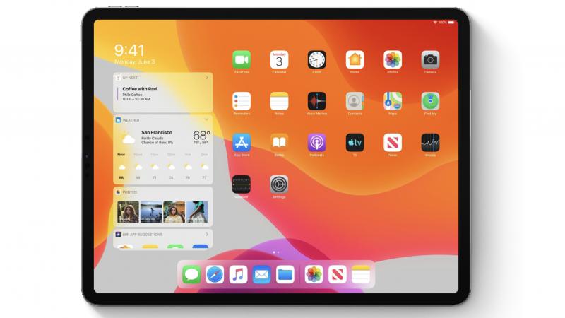
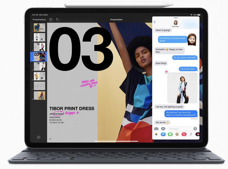
iPadOS, in a nutshell, builds on the foundation of iOS, and adding more powerful capabilities and features specific to the iPad’s larger display and beefy hardware.
The first thing Apple has done is redesign the Home screen. There’s a new layout that shows more apps on each page. What I like is that the Home screen now has a Today View—-quick access to widgets like news headlines, weather, calendar, events, and more. So, you no longer need to swipe right to see your widgets.
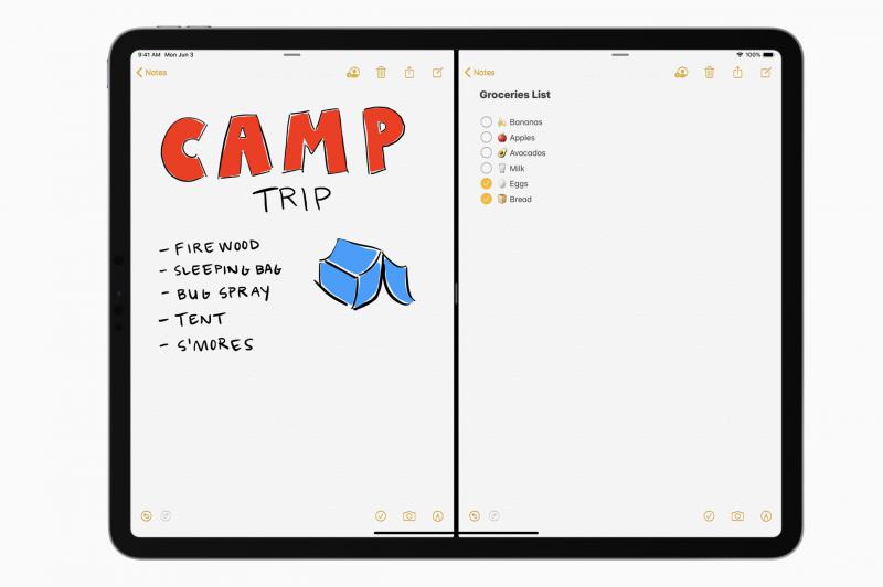
With iPadOS, Apple fixes one of the major limitations of its Split View multi-window feature. You can now have multiple files or documents from the same app open side-by-side, or in a Slide Over panel.
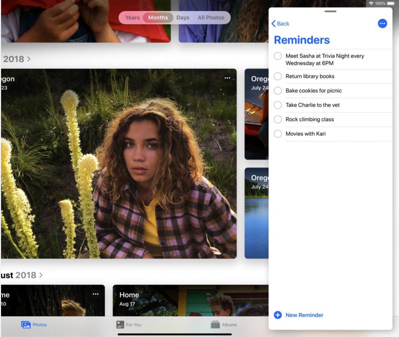
This is especially useful when I’m writing and need to refer to another webpage in separate browser window in Safari. Or if I’m composing an email and need to refer to another email.
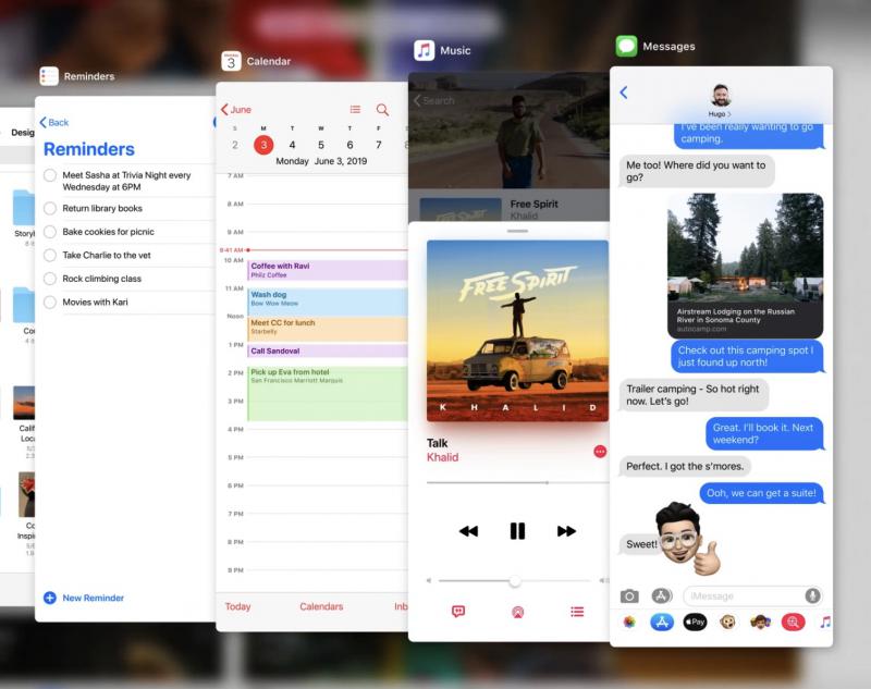
Also, there’s App Expose that shows you a quick view of open windows for any one app. So far, so good.
Next, file management. The Files app, the central place for all your files and documents gets better in iPadOS. It now has better iCloud support—now with folder sharing. Like Google Drive or OneDrive, anyone with access to the shared folder will be able to see it in iCloud Drive.
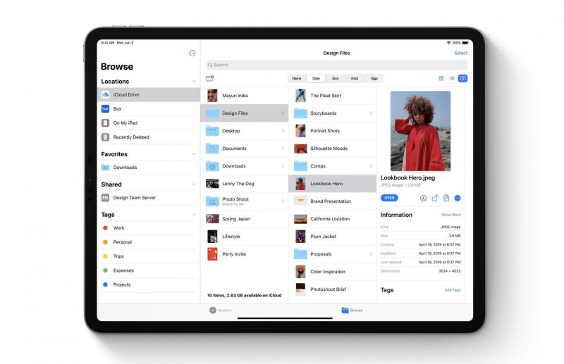
What’s great is also the new Column View with high-resolution previews. This makes the Files app more Finder-like, making navigating directories much easier. Also, there’s support for Quick Actions where you can quickly mark up, rotate or create a PDF. With Quick Actions, you can also mark up, rotate and create PDFs easily.
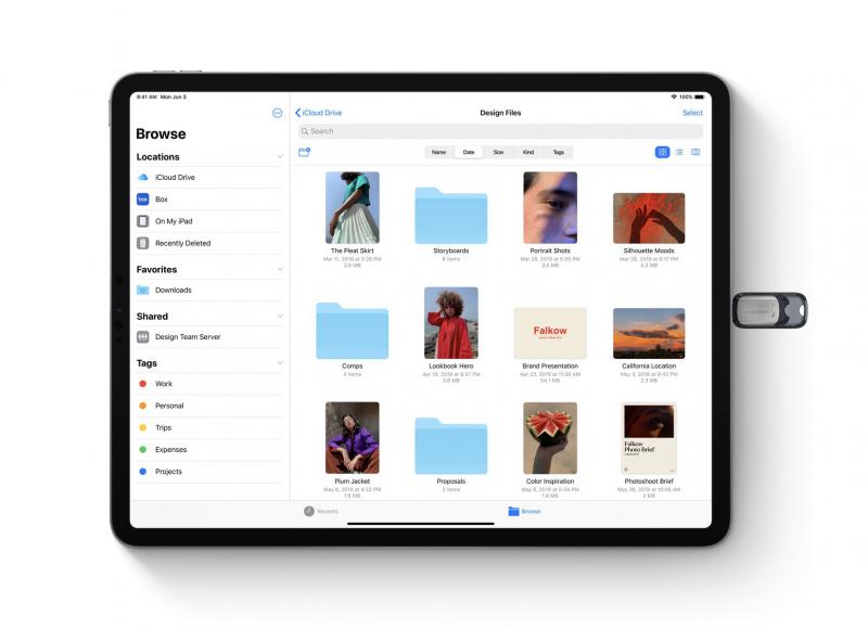
For those who like plugging things into ports, iPadOS now supports USB drives and SD cards. You can also log into an SMB file server from within the Files app, as well as zip and unzip files.
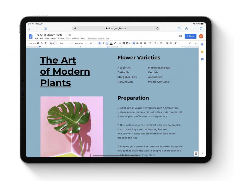
One new feature I’m really looking forward to is desktop-class browsing with Safari. No more mobile versions of websites, by default. Safari will present the desktop version of the website, properly scaled for the iPad display and optimises it for touch input. Apple says web apps like Google Docs and WordPress will work great in Safari. From the demos I’ve seen during the keynote, I’m thrilled to see this finally happening. It’s a long time coming.
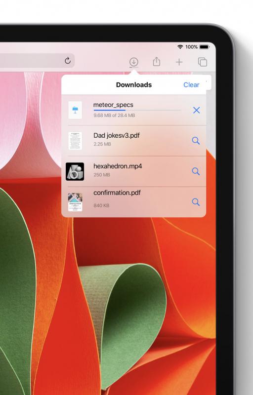
Safari also gets a download manager (yes!), 30 new keyboard shortcuts and enhancements to tab management.
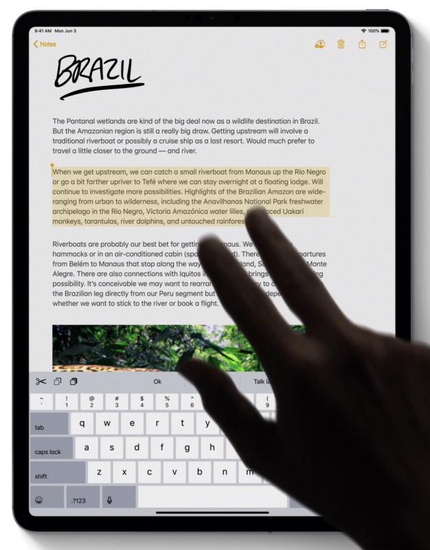
With iPadOS, Apple is giving text editing a major update. It’s now easier and faster to point with even more precision and speed. Select text with just a swipe; with new gestures to cut, copy, paste and undo (you no longer need to shake the iPad!).
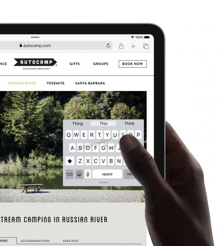
Still on the subject of typing, a new floating keyboard invoked by pinching on the virtual keyboard makes one-handed typing easy. You can drag it anywhere on the screen and also use Quick Path—the Swype-feature introduced in iOS 13.
A welcome feature for creatives is the ability to install Custom Fonts across the system. Fonts from vendors like Adobe, DynaComware, Monotype, Morisawa and Founder will be available on the App Store for purchase and download.
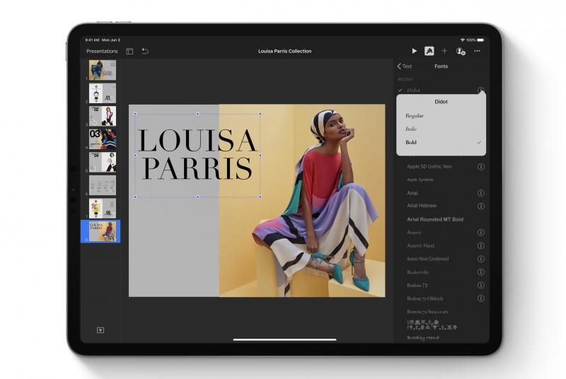
With iPadOS, the Apple Pencil gets even better. The Apple Pencil feels even more natural, and Apple has improved its already industry-leading latency from 20ms to as low as nine milliseconds.
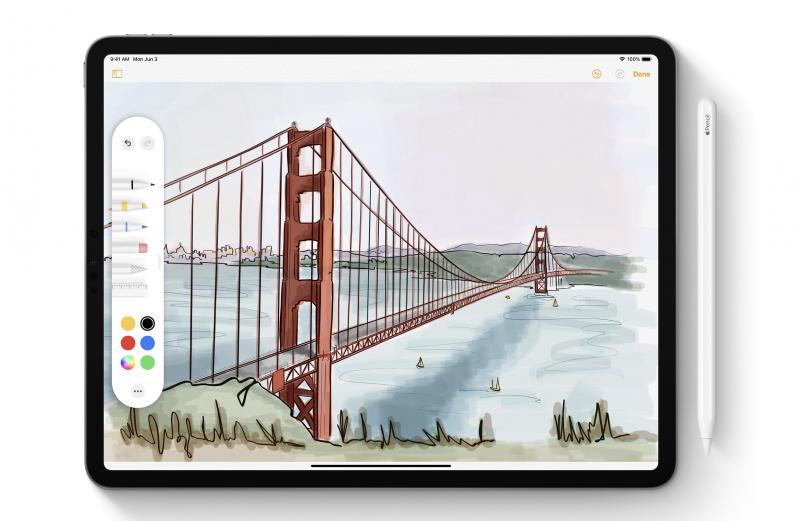
By swiping Apple Pencil from the corner of the screen, you’ll have access to a redesigned tool palette that houses tools, colour palettes, shapes, object eraser and a new pixel eraser as well as a ruler.
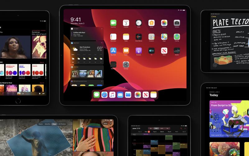
Let’s also not forget Dark Mode that was introduced in macOS Mojave last year and this year on iOS 13. The dramatic dark colour scheme looks fantastic.
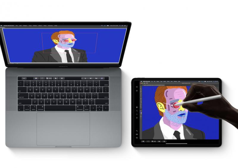
I also look forward to Sidecar, introduced with macOS Catalina—a feature that lets you extend your Mac desktop by using the iPad as a second display, or a touch-input device across Mac creative apps.
Availability
The developer preview of iPadOS is available to Apple Developer Program members at developer.apple.com. The public beta program will be available to iPadOS users later this month at beta.apple.com.
iPadOS will be available this Fall as a free software update for iPad Air 2 or later, all iPad 2 models, iPad 5th generation and later, and iPad mini 4 and later.
Summary
With iPadOS, the iPad gains powerful new tricks, making it an even more compelling platform for productivity. It’s easy to forget that the iPad isn’t just a great tablet for media consumption, but also a powerful, versatile computer that can get sh*t done. It also propels the iPad closer to the reality as a viable notebook replacement. The future of Mac computing in the making?


