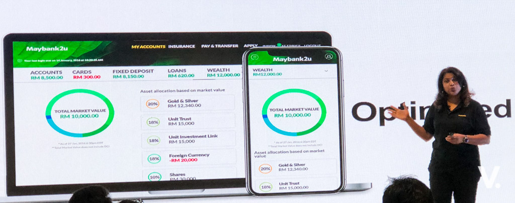
Maybank has just previewed its refreshed Maybank2u website to the press today. The reimagined online banking portal will go live to the public on 19 April.
Since it pioneered the online banking service in 2000, the bank has seen the number of transactions on Maybank2u (M2u) rising steadily each year, topping 4.27 billion in 2017. The leading online banking platform expects the number of its online banking transactions to increase to 6.4 billion in 2018.
The bank revealed that last year, the total number of online banking monetary transactions via M2u hit 360 million and at its peak, it recorded a whopping 20 million transactions in one day.
The bank has seen a rapid shift in the number of transactions conducted online compared to traditional over-the-counter services. This is understandable, seeing the trend of consumers moving towards more digitalised services.
Last year, around 99.6 percent of Maybank’s total consumer banking payments and transfers were conducted online and through its self-service platforms.
M2u currently has 10.69 million registered users, with 50 percent actively using the platform.
The new M2u website is a complete makeover in terms of user interface and user experience – simple, more personalised and customisable, as well as mobile optimised.
Group Chief Strategy Officer Michael Foong said the new website was part of the Group’s ongoing efforts to strengthen its digital banking offerings, working towards becoming the digital bank of choice in the region by 2020.
For the new website, Maybank listened to its customers, drawing insights and valuable feedback to enhance the overall online banking experience.
Fully-developed in-house, the site went through several weeks of pilot before being revealed today. The site is optimised across various browsers and platforms and is now mobile responsive.
Maybank says the rollout of the new website will be progressive, and during the initial phase customers can still access the classic site. Both versions will be available for the next few months.
So, what’s different about the new Maybank2u?
The homepage greets you with a large header image, and a main login text box. It almost has an Airbnb feel to it.
You can now use your own pictures for the Security Image that displayed before you login to the site. You can also personalise the overall theme of the site with four different themes. It will then change according to different times of the day.
The other thing is that the site displays remittance options when you wish to transfer funds overseas. This provides transparency of charges and foreign exchange rates, as well as an indication of the time taken for a transfer.
Next, there’s a 360-degree dashboard that gives you a holistic view of your accounts and investments.
Coming soon is a Debit and Credit Card Spending Pattern tracker, and a Goal Savings Plan which offers a customer savings planner for you to plan and achieve financial goals with specially created sub-accounts.
Overall, the new site is clean, slick and appealing.
The site is currently under beta. You can try the new experience here: www.maybank2u.com.my/new.
The new Maybank2u will go live to public from 19 April 2018.


