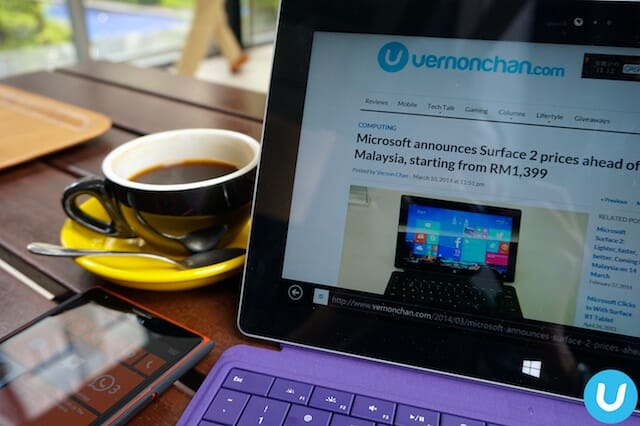
The Surface was Microsoft‘s first real foray into the hardware business. If anything, it proved one thing. Microsoft can make excellent hardware. Coupled with Windows 8 (and its RT variant), the Surface and Surface Pro later on proved that tablets weren’t just devices for play and content consumption, but could double up as productive, content creation devices too. With the Surface 2, Microsoft has improved some of the shortcomings of the original Surface, and enhanced some key areas of the tablet.
Courtesy of Microsoft Malaysia, I’m one of the fortunate few to have been loaned a unit for review, which I understand is of very limited supply at this moment. By the time you read this, the big official Malaysian launch of the Surface 2 would have already happened.
So, what’s different?
You may have already noticed this – Microsoft has dropped the ‘RT’ moniker from Surface brand. It hasn’t however dropped ‘RT’ from the Windows variant that is Windows RT 8.1.
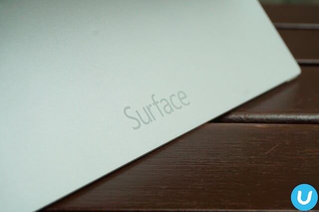
Some external changes that has been done include the much improved two-angle kickstand, a slimmer, lighter profile, a silver grey finish to differentiate from its Pro sibling and uprated main and secondary cameras.
Under the hood, the Surface 2 now sports the powerful quad-core Tegra 4 processor from NVIDIA. Another noticeable change is the inclusion of a 10.6-inch ClearType Full HD display providing much crisper, vibrant color reproduction.
What hasn’t changed though is the excellent ‘click’ mechanism of the Surface and the super sleek Touch Cover 2 and Type Cover 2. Additionally, the Surface 2 retains its highly durable VaporMg body and overall stylish industrial design.
Out-of-the-box, the Surface 2 runs the new Windows RT 8.1 and also comes pre-loaded with Microsoft Office Home and Student 2013 RT and Outlook 2013 RT.
For more photos of the Surface 2, visit Flickr.com.
First impressions
I immediately find the Surface 2 familiar, having used the older Surface Pro for an extended period of time. The Surface 2 of course, is much lighter and slimmer.
What I really like the two-step, dual-angle kickstand. A problem I had with the older Surface and Surface Pro was that the default, single-angle was too upright for most usage scenarios. Whether propped up on the desk, or on my lap, it was difficult to get the optimum angle. I found myself stuffing books and stuff underneath to modify the viewing angle. But with the new Surface 2, it’s close to perfect.
A glaring difference is the screen. If you were disappointed with the low-res screen on the original Surface, then you’re in for a treat.
The Surface 2 now houses the 10.6-inch ClearType Full HD display. It’s immediately just world’s better. A much welcomed improvement.
Another obvious change is the underlying hardware. The Tegra 4 chip is a known powerhouse and the difference in performance versus the old is substantial. Things are just so much snappier and fluid. I’ll do some benchmarks later and some real world tasks to see how the Surface 2 performs under more strenuous exercises.
Microsoft has also improved both the Type and Touch covers, now with more responsiveness and backlighting. I’m more a Type Cover type of guy (pun intended) but my brief experience with the new Touch Cover 2 got me impressed as well.
So, that’s the story so far. Stay tuned for a more in-depth review.
The Surface 2 32GB version sells for RM1,399, whilst the 64GB version sells for RM1,699.00. Full price list here.


