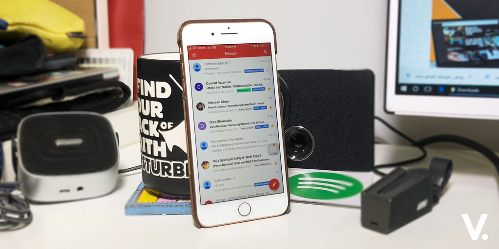
Google is planning to launch a new Gmail design in the coming weeks, with the refreshed design bringing it closer to the current Gmail on mobile. The new design is currently being tested inside Google and with trusted partners. It includes some elements of Google’s Material Design and some features adopted from Google Inbox.
The first thing you’ll notice is the new sidebar, with an option to view and use Google Calendar, Keep (note-taking) or Tasks alongside your email messages. While it may look cluttered on smaller screens, it will make it easier to schedule meetings or add tasks from the same window.
There will be three layouts to choose from – Default View that highlights attachments like documents and photos; Comfortable View that doesn’t highlight attachments; and Compact View that squeezes more messages into a single page.
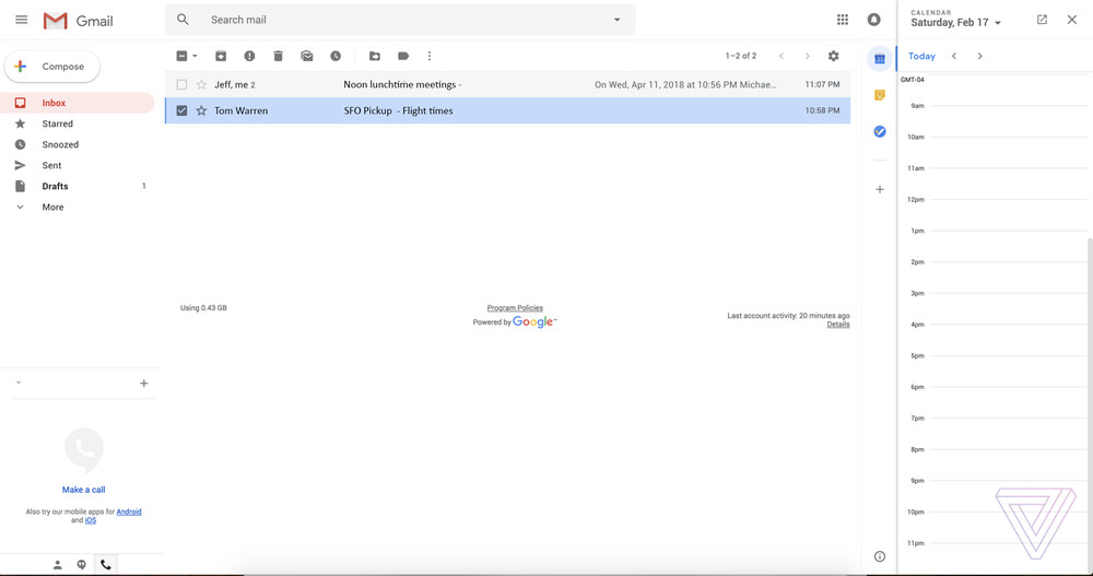
As posted on The Verge, the overall design and UI changes aren’t as radical as the Inbox redesign that Google rolled out in 2014.
In terms of features, Google is implementing smart replies, as you’ve seen the mobile version of Gmail. Gmail provides suggested one-click quick replies to emails.
A new snooze feature lets you temporarily remove emails from your inbox until a certain time. This is to “mute” certain email threads until you’re ready to reply.
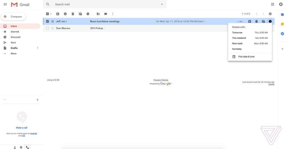
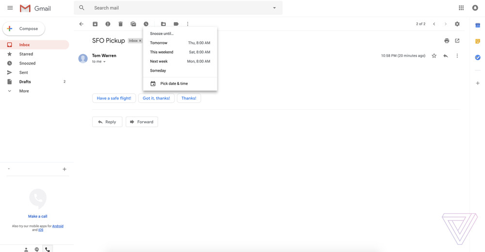
Both features are currently available as part of Google’s Inbox app for Gmail.
It is said that Google is planning to make the new design available for G Suite and Gmail users in the coming weeks. With Google I/O happening on 8 May in Mountain View, it is widely believed that the new Gmail design will be officially announced then.
Source: The Verge


